Charts and Graphs
In addition to displaying information in text  and table
  formats, there is also an option to view results in the form of charts
 ![]() . This mode allows, for example, data from different archival units to be compared.
. This mode allows, for example, data from different archival units to be compared.

Chart Type "By categories"
Since the default chart type is "By categories," let’s examine it first. By clicking on the dropdown tab "Category," you will open a list of categories that can be used to view the data in the form of charts.

Unit Title
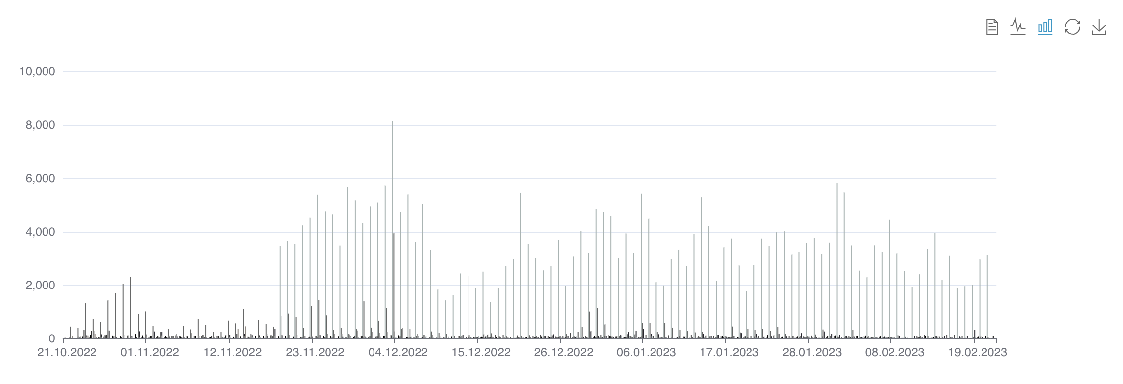
If you select the first category, "Unit Title," the information will be filtered by archival unit titles. This chart compares the number of messages in the selected archival units over a specific period of time.

Let’s look at what the other categories in the "By categories" list display:
Unit Type
Сompares the number of published messages in chats and channels over a specific period of time.

Thematic Collection
Compares the number of messages in different thematic collections.

Post Type
Compares the number of posts, comments, technical messages, and dates across all archival units available to the user.

Hashtags
Compares which hashtags and their frequencies are mentioned over a specific period of time in the selected archival units.

Mentions
Displays the number of messages that contain mentions using "@".

URL
Shows the number and list of domain names mentioned in the selected archival units.

Has images
Displays the number of messages with and without images in the selected units. The same principle applies to the categories "Has audio" and "Has video."

Email
Displays which email addresses are mentioned within the selected period.

Author
Shows the number of messages created by a specific author.

Language
Displays the number of messages written in Ukrainian, Russian, English, etc.

Country
Shows the frequency of mentions of a specific country in the archival material.

The "Categories" panel is similar to the "Filters" panel. However, they do not duplicate functions but rather complement each other. They can be combined to narrow down the search, make comparisons, or visualize the search results across multiple parameters simultaneously. For example, to reduce the number of archival units for comparison, select "Unit Title" in the "By categories" charts, and choose several archival units in the "Unit Title" filter. As shown in the screenshot, now only two chats are displayed instead of all.

Just like in text and table formats, you can view the results of text searches in the chart format. We can select the "Unit Title" category and enter the word Україна (Ukraine) in the search field. As a result, the chart will display how many times and when the word Україна (Ukraine) was used in the selected archival units.

Chart Type "By custom query"
With this feature, you can create custom text queries that search across all selected archival units, and then add the results layer by layer to the chart using the  button. To obtain more relevant search results, entering a phrase with the "+" symbol will make the search more effective. If you enclose your query in quotation marks (" "), the system will find only exact matches that are fully identical to your request.

If required, you can separate the combined charts into individual charts. To do this, uncheck the  box. As you can see, the archival units are no longer combined into one chart but are displayed in separate individual charts.

Additional features
Data view ![]() - shows the numerical data on which the chart is based.
- shows the numerical data on which the chart is based.

The "Switch to Bar Chart" ![]() button allows you to change the chart type from a line chart to a bar chart.
button allows you to change the chart type from a line chart to a bar chart.

Restore ![]() – restores the previous chart settings
– restores the previous chart settings
Save as Image ![]() – allows you to download the chart image in .png format.
– allows you to download the chart image in .png format.
Last updated